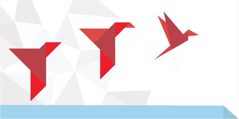
When it comes to naming a consulting firm, name choice carries significant weight. The name must encapsulate the essence, mission and vision of the company. For O2 Consulting Group, the decision to name the company after the chemical symbol for oxygen and to use a red origami bird for their logo was both deliberate and deeply symbolic.
Oxygen (O2): Breathing New Life
Oxygen is essential for life. It fuels our cells and drives the processes that keep us alive and thriving. In the same way, O2 Consulting Group aims to breathe new life into organizations. The metaphor extends beyond mere survival; it’s about growth, vitality and optimization.
By choosing O2 as its name, the firm wanted to emphasize its commitment to revitalizing businesses. Their approach is holistic, addressing every aspect of an organization’s strategy and operations, from people and processes to systems. Just as oxygen is crucial for a healthy, functioning body, O2 Consulting’s approach to strategic and operational excellence can be vital for a business to thrive and stay competitive.
The Origami Bird: Precision and Artistry
The origami bird in O2 Consulting Group’s logo is not just a beautiful image; it carries profound meaning. Origami is an art form that requires meticulous attention to detail. Each fold must be precise, and every step must be carefully planned to achieve the desired outcome. This mirrors the attention that organizations should take to perfect their strategic and operational planning – O2 Consulting Group’s specialty. The team guides clients not only on what to do but also on how and why, ensuring every strategic move is executed with care and precision.
Strategy and execution must be handled with the same precision and care as an intricate piece of origami. Missteps can lead to failures, but with the right expertise and careful planning, the results can be extraordinary. O2 Consulting Group strongly believes in this, ensuring that each step in a client’s strategy and operations journey is executed flawlessly, leading them to an incredible future.
The Power of Red
Color psychology plays a significant role in branding, and the choice of red for O2 Consulting’s logo is no accident. Red symbolizes power, passion and energy. It’s a color that conveys strength and determination. For O2 Consulting Group, the red origami bird represents the power and value their team brings to their clients. The team’s strong commitment and passion for optimizing people, processes, and systems are the driving forces behind their success.
The red origami bird represents the firm’s dedication to excellence. It reflects the power of transformation that O2 Consulting Group offers, turning complex challenges businesses face into streamlined, efficient and effective solutions.
O2 Consulting Group’s name and logo are more than just a brand; they are a statement of intent and a reflection of the team’s core values. By aligning themselves with the symbol for oxygen, they highlight their role in breathing new life into organizations. The origami bird signifies the precision and artistry required in strategic and operational planning. And the red color signifies the power and passion they bring to every project. Together, these elements represent O2 Consulting Group’s mission to help businesses grow, optimize and excel in their strategic and operational planning.
Would you like to learn more about working with O2 Consulting Group? Contact us today!


